LONELY PLANET GUIDES
Destination Discovery, a Curated Travel Planner
Duration: 2 Week Sprint
Imagine being able to experience the culture of a new country, right from your phone. For this concept design project I tackled redesigning Lonely Planet Guides application to improve their business model which was negatively affected by the COVID-19 pandemic. This application redesign utilized human-centered-design to bring personalized trip planning and virtual experiences to the forefront for young users living in social isolation during this pandemic.
Meet the Team

Corinne Sawyers
UX Research Lead & Designer

Jeffrey Chan
Project Manager & Designer

Ivan Capanzana
Lead Designer


METHODS & TOOLS
-
Competitive Analysis
-
Surveys
-
User Interviews
-
Data Synthesis
-
Affinity Map
-
Persona
-
Problem Statement
-
How Might We Statement
-
Brand Guide
-
User Journey Map
-
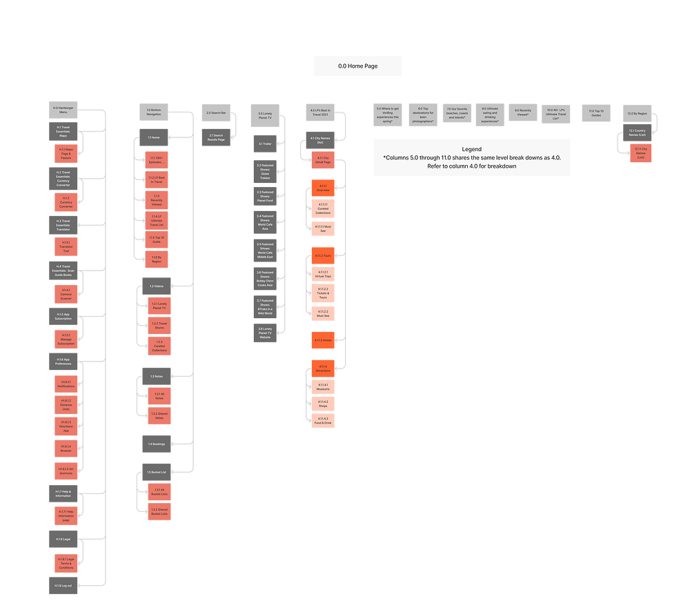
Information Architecture
-
User Flow
-
Sketches
-
Wireframes
-
Prototypes
-
Usability Testing
-
Figma
-
Figjam
-
G Suite
-
Microsoft Office
-
Slack
-
Zoom
THE PROBLEM
THE CHALLENGE
Lonely Planet’s app was built for people that can travel; it lacks a virtual travel experience for those who cannot.
How might we evolve Lonely Planet’s business plan to incorporate not only active travelers, but also travelers in isolation?
MY APPROACH
THE TARGET
My approach is to design application features which allow users to plan personalized trips and experience travel locations virtually.
The target demographic for this product was young adventurers all across the United States.
THE PROCESS

DISCOVER
COMPETITIVE ANALYSIS
In order to address the needs of Lonely Planet’s users we competitively analyzed the features on your existing app with some of your top competitors. This table indicates some missing features we focused on in Lonely Planet’s app redesign.
%20(1).png)
INITIAL THOUGHTS
To help young people who are isolated during the pandemic and can not travel as they wish, we crafted a list of features we think Lonely Planet users would want, those are listed here.
-
Use videos and virtual experiences to improve immersion
-
Ability for users to do research based on other people’s opinions
-
Have suggestions on what to do in a particular city
-
Ways to take notes on travel research and share with others
-
Tour suggestions and ways to booking them
SURVEYS
For our initial research method we sent out a survey to a broad scope of participants that use travel apps to gain more insights about the types of questions we should be asking in more detailed user interviews and to collect some, mostly quantitative, data.
%20(1).png)
USER INTERVIEWS
For our secondary research method we set up user interviews with a smaller group of individuals to collect mostly qualitative data to shape the way we redesigned Lonely Planet's app.
USER INTERVIEW INSIGHS
“I love traveling. But I am also just happy to see other people traveling as well. I think everyone should be able to do it, and I wish that it was more accessible to everyone.”
“I am looking for a person to travel with that has a degree of spontaneity but also has ideas.”
“I like having recommendations for food, for places to stay, and also for things to do.”
“The concept of traveling alone is scary, and I think it’s because I’m a girl.”
DEFINE
AFFINITY MAP
Based on the user interviews we synthesized the user data into an affinity map. An affinity map is a design strategy that groups overlapping pain points expressed by users to determine the users’ needs in the form of I statements.
I STATEMENTS
.png)
BUSINESS GOALS
1. Maintain and broaden Lonely Planet's brand appeal with young travelers during COVID-19.
2. Help young people explore during times of isolation.
3. Encourage young people to become future travel adventurers.
PERSONA
We crafted this user persona with a fictional character Ashley based on our user research. Her goals and characteristics represent the needs of a larger group of users which we designed for.
%20(1).png)
PROBLEM STATEMENT
We came up with a problem statement to address the current needs of the user.
The user needs a way to easily find and collaborate travel ideas with their friends because sharing experiences is important to them and one application does not currently have all the tools they need to do this.
HOW MIGHT WE STATEMENTS
These How Might We Statements help us to generate creative design solutions to address the problem statement.
-
How might we give Ashley a remote travel experience when she can not travel during the pandemic?
-
How might we allow Ashley to share experiences or enjoy other people’s experiences on a single application?
-
How might we help Ashley keep her travel ideas organized and effectively share them with her companions?
-
How might we help Ashley get access to all of her traveling tools on one particular platform?
DESIGN
BRAND GUIDE
In order to design in a style consistent with that of our client, we crafted a brand style guide consisting of brand colors, typeface, logos and other necessary design elements.

DESIGN
BRAND GUIDE
VALIDATED ASSUMPTIONS & NEW IDEAS
What have we confirmed? What direction will we take?
-
Booking options
-
Access to user photos and reviews
-
Taking notes
-
Share travel plans
-
Online Experiences - Virtual Trips
-
Prioritize a mobile experience with all the features
USER JOURNEY MAP
This is a journey map we made to visualize the process that a user goes through in order to achieve a goal. For this journey map the user would be someone who uses the Lonely Planet app in its current state to find and book a travel tour with a friend. The emotions on this journey map indicate some pain points that we plan to research and address in our app redesign proposal.
.png)
PROPOSED USER FLOW
Here is a flow that we are proposing users will experience with our redesign. The main takeaway here is that users will get opportunities to make the following decisions:
-
Filter for safe places to stay in during travels
-
Browse user reviews, photos and travel shorts
-
Opportunity to sign up for a virtual trip and then watch the livestream
-
Creating notes to share with others
.png)
%20(1).png)
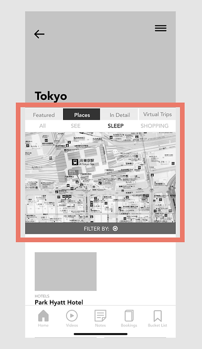
MID-FI WIREFRAMES

TEST & ITERATE
MID-FI PROTOTYPE
For the mid-fi prototype we gathered 3 individuals to test out the app. We gave them 5 tasks that they have to complete. The tasks were:
1. Get to the Tokyo page.
2. Find Park Hyatt Tokyo hotel and add it to the Bucket List.
3. Find Ghibli Museum, add it to the Bucket List, and then share it with Alexis.
4. Find the Senso-ji Temple virtual trip, book a virtual trip, and then join the livestream.
5. Create a new note and share it with Alexis and Chris.

MID-FI USABILITY TESTING
Our users had some very insightful feedback on the challenges they faced when testing our first round of wireframe prototypes.
MID-FI USER CORE INSIGHTS
“I wish that I could search within Tokyo.”
“What was difficult for me was some of the naming, that was a little confusing.”
“Overall it took a little bit of work, but I could navigate. If I had to navigate backwards through the home page every time I used the app, I probably wouldn’t use the app often.”
“There was a lot to process on the Tokyo page.”
“I normally wouldn’t look under places for a hotel. Places is too broad of a term that can be interpreted in different ways.”
.png)
MID-FI WIREFRAMES WITH ANNOTATED USER FEEDBACK
USER FEEDBACK
-
Map was not useful or relevant.
-
Filter button was unclear.
-
Upper navigation bars were crowded.
-
Too many choices in navigation and wording was confusing.
%20(1).png)
USER FEEDBACK
-
Users want another way to navigate besides the back arrow.
-
Icons next to names were misinterpreted as checkboxes.
.png)
USER FEEDBACK
-
Scrolling to the bottom of the page to reach “Create New Note” was a pain point.
-
Users wanted "Create New Note” to be easily visible without scrolling.
.png)
REVISIONS BASED ON FEEDBACK
-
Removed map on details page
-
Added spacing between navigation bars
-
Renamed categories to make it easier to navigate
-
Breadcrumb was implemented for easier navigation between pages
-
Inserted user photos into avatar placeholders
DESIGN (CONTINUED)
HI-FI WIREFRAMES
-
These hi-fi wireframes address the pain points that the first round of testers had.


HI-FI PROTOTYPE

After iterating and implementing design solutions that addressed our users’ pain points we gathered two more individuals to test out the revised app.
HI-FI USABILITY TESTING
Our new set of users navigated our revised designs with much fewer pain points than our first set of users following our implemented design iterations.
HI-FI USER CORE INSIGHTS
“The back to Tokyo breadcrumb was very intuitive. The lower navigation bar is very light colored and did not draw my attention right away.”
“I really enjoyed the livestream and how this was inside the app and not redirecting me to another app.”
“I enjoyed the upper navigation titles. They represent very obvious things that people would do and look for when traveling.”
.png)
HI-FI WIREFRAMES WITH ANNOTATED USER FEEDBACK
USER FEEDBACK
-
Main navigation on bottom of page was not noticeable due to color and grayscale presentation.
-
Some users were concerned that the share buttons may be too small when viewing on mobile.
.png)
USER FEEDBACK
-
Safety rating concept was difficult to understand. Users shared that they were used to a star rating system.
-
Indicators such as 3 out of 3 or definitions on what safety ratings meant were suggested by users.
-
“Sort by” button was unclear. Users didn’t know it was a button.
USER FEEDBACK
-
Breadcrumb trails was well received, but it took users back to the overview page. Users expected breadcrumb to help navigate back to previous page only.
-
Virtual Trips heading was scrolling with the images. Users wanted the heading to be in a fixed position to avoid confusion.
%20(1).png)
REFLECT & GROW
NEXT STEPS
How can we further improve the users' experience?
The high fidelity prototype was the final product delivered for our project scope. However, as a team, we still have many concepts and ideas that we wanted to add. If time allows, we want to add some of these points and features to improve the overall Lonely Planet app experience.
-
Allow users to write reviews
-
Ability to upload videos & photos
-
Edit UI elements to improve flow and clarity (i.e., Headings, proper scrolling, breadcrumb navigation, etc.)
-
Improve Sort Button layout & features
-
Additional research on user expectations regarding safety and identify better metrics for it.
-
Ability to access restaurant information (i.e., Menus & Ordering Food)
-
Improve bottom navigation visibility (i.e., contrast and accessibility concerns)
-
Booking Features - Import external bookings and organize all bookings in itinerary
-
Information on covid safety/ vaccine requirements
.png)
REFLECTION
This was my first ever collaborative design project, and with the team element came a few obstacles to tackle. Some obstacles we faced were:
-
Different Time Zones and Time Constraints
-
Decision Authority
-
Role Assignment
-
Division of Deliverables
We collaborated to come up with reasonable solutions to these obstacles in a team working agreement. Together we decided to:
-
Make a timeline laying out all deliverables that needed to be completed and assign by day the deliverables which needed to be completed in class and also part of after-hours work. Meet daily to discuss progress and blockers.
-
Make all group decisions by a democratic voting system, since there were three UX Designers total on our team if two of three agreed the decision was made.
-
Assign roles based on individual strengths pertaining to prior work and education experience.
-
Divide deliverables to allow each member of the team to make a contribution to each deliverable, with project role dictating the magnitude of our contribution.