FINLI
Financial Lift, Small Business Management Software Interface
Duration: 3 Week Sprint
Running a small business can be challenging, but with the tools Finli provides, this enables business owners to focus more on their business goals and less on administrative tasks. For this contracted UX/UI design project my team and I tackled designing Finli's scheduled invoice building software interface to provide customers with a tool to grow their business' scheduled invoicing abilities through their mobile device. With the current market trend of increased mobile business scheduling and transactions, Finli's existing desktop interface was out of reach. This mobile first responsive redesign will allow small businesses to reach their invoicing goals on-the-go and follow their dreams to their full potential.
Meet the Team

Corinne Sawyers
UX Research & Design, Project Management

Michael Ho
Lead Designer

Hein Tun
UX Research & Design

.png)
METHODS & TOOLS
-
Competitive Analysis
-
Surveys
-
User Interviews
-
Data Synthesis
-
Affinity Map
-
Persona
-
Problem Statement
-
How Might We Statements
-
Brand & Components Guide
-
User Journey Map
-
Information Architecture
-
User Flow
-
Wireframes
-
Prototypes
-
Usability Testing
-
Figma
-
Figjam
-
G Suite
-
Slack
-
Zoom
THE GOAL
THE CHALLENGE
The Finli UX Team's mission is to create an invoice builder for mobile that allows the customers to view and create recurring or scheduled invoices on the go.
How might we evolve Finli's current business platform to incorporate not only scheduled invoicing features through desktop but also for business owners on-the-go?
MY APPROACH
THE TARGET
Design a mobile first responsive scheduled invoice builder which allow users to send personalized recurring invoices for future products and services in an instant with their mobile device.
Our target demographic is small business owners all across the United States.
THE PROCESS

DISCOVER
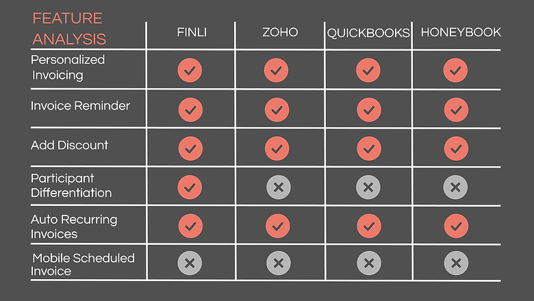
COMPETITIVE ANALYSIS
In order to address the needs of Finli's users we competitively analyzed the features of their existing software interface with some of their top competitors. This table indicates some missing features we focused on in Finli's scheduled invoice builder design.
%20(1).png)
SURVEYS
For our initial research method we sent out a survey to a personalized scope of participants that are small business owners and/or freelancers to gain more insights about the types of questions we should be asking in more detailed user interviews and to collect some, mostly quantitative, data.
SURVEY INSIGHTS
"I would like to save frequently used line items, use a direct link on an invoice to make a payment, and have a free trial to test paid service."
"I would like an all-in-one software that handles all of my business needs."
"I would like to know how much fees will be charged for collecting payments, and to find the right invoice template for my products"
%20(1).png)
USER INTERVIEWS
As one of our primary research methods to gain insights on the goals and necessary features that small business owners have for invoicing, we conducted several in depth user interviews and were given many insights to help us structure our design.
USER INTERVIEW INSIGHS
"It would be helpful for me if I am provided with a simple and relative invoice template that I could have most of the necessary information prefilled."
"Sometimes I use other methods of creating an invoice because it can take some time to get into the invoice builder, open the customer, and create an invoice."
"If I had to create a new invoice from scratch each time I would probably not use the service because it is too time consuming."
"I have ongoing customers that need the same service done monthly."
DEFINE
AFFINITY MAP
Based on the user interviews we synthesized the user data into an affinity map.An affinity map is a design strategy that groups overlapping pain points expressed by users to determine the users’ needs in the form of I statements.

I STATEMENTS
BUSINESS GOALS
1. Maintain continuity between the mobile first responsive scheduled invoice design with the existing desktop design.
2. Be able to back up design decisions with user research data, especially if it is a big ask for the developers.
3. Allow for Finli customers to create scheduled invoices on-the-go.
We crafted this user persona with a fictional character, Teo, based on our user research. His goals and characteristics represent the needs of a larger group of users which we will be designing for.
PERSONA
.png)
PROBLEM STATEMENT
This problem statement addresses the current needs of the user.
The user needs an accessible invoice builder that allows them to quickly generate custom scheduled invoices on the go for their clients.
HOW MIGHT WE STATEMENTS
These How Might We Statements help us to generate creative design solutions to address the problem statement.
-
How might we create a customized recurring invoice from mobile device?
-
How might we keep the invoice updated on last- minute changes & deposits?
-
How might we simplify the invoice builder to save time on the go?
-
How might we track & follow up on outstanding invoices?
DESIGN
BRAND GUIDE
In order to design in a style consistent with that of our client, we crafted a brand style guide consisting of brand colors, typeface, logos and other necessary design elements.
DESIGN
BRAND GUIDE
.png)
%20(1).png)
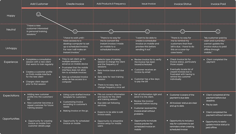
This journey map is made to visualize the process that a user goes through in order to achieve a goal. For this journey map the user would be a Finli customer that uses the software interface in its current state for scheduled invoicing. The emotions on this journey map indicate some pain points that we planned to research and address in our design proposal.
PROPOSED USER FLOW
Here is a flow that we proposed users would experience with our design. The main takeaway here is that users will get opportunities to use the following features that were not previously accessible:
-
Ability to create and edit scheduled invoices on mobile
-
Ability to manage invoices with batch update
-
Ability to convert an instant invoice to a scheduled invoice
-
Ability to set payment reminders

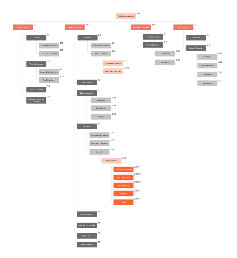
INFORMATION ARCHITECTURE -
PROPOSED SITE MAP

%20(1).png)
MID-FI WIREFRAMES
TEST & ITERATE
MID-FI PROTOTYPE
For the mid-fi prototype we gathered 3 individuals to test out the software interface. The tasks we gave them to complete were:
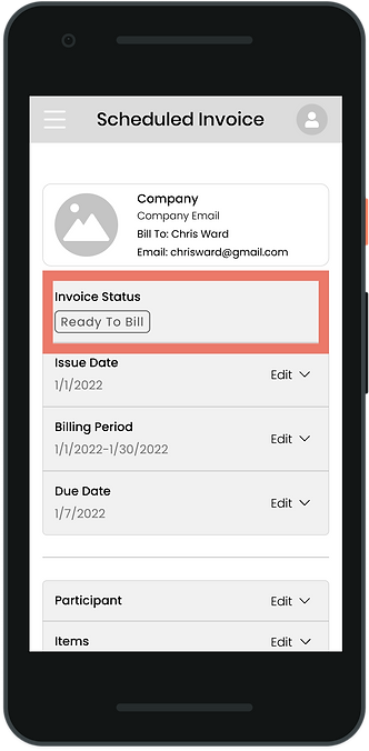
1. Create a scheduled invoice for Chris Ward with the set dates.
Description: Create an invoice for Chris Ward with the issue date as 1/1/22, a billing period of 1/1/22-1/31/22, and a due date 1/7/2022.
2. Add a new participant to this invoice named Andrew Baker.
Description: The participant is the person the services will be for, in this case this is Andrew Baker. Add him to the invoice.
3. Add items 1 and 2 to the invoice.
For this invoice also add items 1 and 2 to the invoice for Andrew Baker.
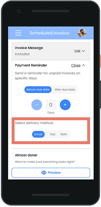
3. Add an invoice message and set a payment reminder 1 day before the due date to be sent by email and text.
Description: Add an invoice message, no need to apply to future messages. Then Set up a payment reminder for 1 day before the invoice due date to be sent via both text and email.
4. Change the invoice status to a draft and return to home.
Description: Change the invoice status to revert to draft and return to the home page.
Follow Up:
1. What did you find the most challenging about the scheduled invoice process? Are there any changes you would have made?
.png)
MID-FI USABILITY TESTING
Our users had some very insightful feedback on the challenges they faced when testing our first round of wireframe prototypes.
MID-FI USER CORE INSIGHTS
"I can see this as a quick way to invoice and collect payments in the future conveniently from your phone."
"I feel the change invoice status should be available at the top of the invoice where it shows the current status instead of having to scroll all the way to the end of the invoice to do this."
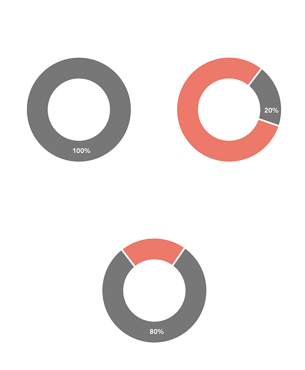
MID-FI USABILITY TESTING MAZE DATA METRICS
We used the usability testing software Maze to get a deeper look at which steps were intuitive to the user, and which steps needed improvement.
Task 1: For this task to create an invoice, users had a misclick rate of 8.3%, an average duration of 4.4 seconds, an average success rate of 100% and an overall usability rating of 96%.
Task 2 For this task to add a participant, users had a misclick rate of 13.2%, an average duration of 4.0 seconds, an average success rate of 100% and an overall usability rating of 94%.
Task 3 For this task to add items, users had a misclick rate of 7.3%, an average duration of 3.1 seconds, an average success rate of 100% and an overall usability rating of 96%.
Task 4 For this task to add a message and reminders, users had a misclick rate of 46.6%, an average duration of 7 seconds, an average success rate of 100% and an overall usability rating of 76%. This lower usability rating indicated a need for design iterations.
Task 5 For this task to change invoice status, users had a misclick rate of 33.3%, an average duration of 12.3 seconds, an average success rate of 66.7% and an overall usability rating of 63%. This lower success rate and usability rating indicated a need for design iterations.
%20(1).png)
MID-FI WIREFRAMES WITH ANNOTATED USER FEEDBACK
USER FEEDBACK
-
Invoice status should be able to be changed from this top section of the scheduled invoice page instead of having to scroll down to the bottom to do this.
%20(1).png)
USER FEEDBACK
-
Users wanted more feedback when a message had been filled.
-
Users struggled with finding the payment reminder section in the closed state.
.png)
REVISIONS BASED ON FEEDBACK
-
Changed date picker to one text field instead of two to limit clicks needed by user based on developer's suggestion
-
Fixed required fields to the page, which eliminates additional clicks from the flow
-
Added toggle on/off to setup frequency to help the user understand that the feature is optional
-
Added an 'Update' button and message to eliminate user uncertainty about whether a new message or an update has been applied
-
Added checkboxes for reminder delivery method because it is more intuitive for the user since there are more than 2 combinations. Similar to invoice message, added a 'Set Reminder' button to ensure user is certain of the action.
-
Grouped current invoice status reminder and action together because layout and labeling in the final steps confused users
-
Incorporated an accordion action bar to display actions to align with Finli's existing designs
-
The goal to offer users a simple way to preview invoices still stands, but we also added an option for users to view/download the invoice in PDF format with feedback from the developers
-
Provided a way users a way to shift between invoicing tools if they wish to convert an instant invoice into a recurring invoice
-
Introduced a batch update feature to mobile to allow users to make invoice changes for multiple invoices at once
DESIGN (CONTINUED)
HI-FI WIREFRAMES
-
These hi-fi wireframes address the pain points that the first round of testers had.

.png)
.png)

HI-FI PROTOTYPE
After iterating and implementing design solutions that addressed our users’ pain points we gathered two more individuals to test out the revised software interface.
HI-FI USABILITY TESTING
Our new set of users navigated our revised designs with much fewer pain points than our first set of users following our implemented design iterations.
HI-FI USER CORE INSIGHTS
“I've used PayPal's invoice builder before, and it's very similar to this one so I have that familiarity on how to use it."
"I thought I could change the invoice status at the top, but that's probably because I am used to the desktop site."
"I assumed the third toggle that said both for payment reminder was a third option of reminder and did not realize that it said both. I would suggest checkboxes for a more intuitive design because I am used to seeing toggles for only two options."
.png)
HI-FI USABILITY TESTING MAZE DATA METRICS
We used the usability testing software Maze to get a deeper look at which steps were intuitive to the user, and which steps needed improvement.
Task 1: For this task to create an invoice, users had a misclick rate of 0%, an average duration of 2.5 seconds, an average success rate of 100% and an overall usability rating of 100%.
Task 2: For this task to add a participant, users had a misclick rate of 0%, an average duration of 3.4 seconds, an average success rate of 100% and an overall usability rating of 100%.
Task 3: For this task to add items, users had a misclick rate of 16.7%, an average duration of 4.1 seconds, an average success rate of 100% and an overall usability rating of 91%.
Task 4: For this task to add a message and reminders, users had a misclick rate of 16.7%, an average duration of 11.1 seconds, an average success rate of 50% and an overall usability rating of 65%. This lower usability rating indicates a need for further design iterations.
Task 5: For this task to change invoice status, users had a misclick rate of 0%, an average duration of 3.2 seconds, an average success rate of 100% and an overall usability rating of 100%.
.png)
HI-FI WIREFRAMES WITH ANNOTATED USER FEEDBACK
USER FEEDBACK
-
Users are still trying to change the invoice status with the top bar instead of the newly implemented floating green action bar. It would be helpful for the user to be able to change the invoice status on the top as well to avoid frustration.
.png)
USER FEEDBACK
-
The payment reminder toggle was not intuitive to users. One user repeatedly clicked either the email or text but did not notice there was a both option. Users suggest implementing checkboxes instead.
.png)
REFLECT & GROW
NEXT STEPS
How can we further improve the users' experience?
-
Establish a link between the listed invoice status on the top of the scheduled invoice page, so that it opens the action bar.
-
Find a way to inform the existing current users on the update and changes about the Schedule Invoice Builder in Finli's mobile interface software.
-
Change the payment reminder toggle to checkboxes.
REFLECTION
This was my first hired position as a UX/UI designer and I learned a lot about what it means to work for a company. Some of the key insights I gained from this experience were:
-
Learning to work with a team across different areas of a company like designers, founders and c-suite executives, customer support, and developers in order to to create a design that aligns with the business as a whole
-
The ability to lead an introduction and project scope meeting with c-suite executives and align on a project scope that works for both the designers and Finli
-
Experience managing a team of designers
-
Usability testing with a real Finli customer and advanced usability testing software